Какая-то мелочь, сижу уже час над этим...
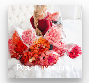
Изначально без наведения:
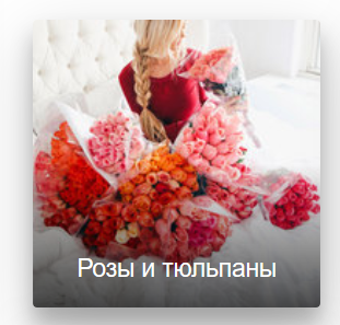
Вот, что нужно на выходе без наведения:
СУТЬ:
есть большой набор стилей для блока с картинкой, там при наведении снизу появляется красивый градиент, мне нужно чтобы он был всегда. переопределить чужой код никак не получается, если интересно вот он:
.thumbs {
/*width: 100%;*/
max-width: 450px; /* опционально */
margin: 10px;
opacity: .99;
overflow: hidden;
position: relative;
border-radius: 3px;
cursor: pointer;
-webkit-box-shadow: 0 12px 15px 0 rgba(0, 0, 0, 0.24), 0 17px 50px 0 rgba(0, 0, 0, 0.19);
-moz-box-shadow: 0 12px 15px 0 rgba(0, 0, 0, 0.24), 0 17px 50px 0 rgba(0, 0, 0, 0.19);
box-shadow: 0 12px 15px 0 rgba(0, 0, 0, 0.24), 0 17px 50px 0 rgba(0, 0, 0, 0.19);

}
.thumbs:before {
content: '';
background: -webkit-linear-gradient(top, transparent 0%, rgba(0, 0, 0, 0.7) 100%);
background: linear-gradient(to bottom, transparent 0%, rgba(0, 0, 0, 0.7) 100%);
width: 100%;
height: 50%;
opacity: 0;
position: absolute;
top: 100%;
left: 0;
z-index: 2;
-webkit-transition-property: top, opacity;
transition-property: top, opacity;
-webkit-transition-duration: 0.3s;
transition-duration: 0.3s;
}
.thumbs img {
display: block;
width: 100%; /* ширина картинки */
height: auto; /* высота картинки */
backface-visibility: hidden;
-webkit-backface-visibility: hidden;
}
.thumbs .caption {
width: 100%;
padding: 20px;
color: #fff;
position: absolute;
bottom: 0;
left: 0;
z-index: 3;
text-align: center;
}

.thumbs .caption span {
display: block;
opacity: 1;
position: relative;
top: 1;
-webkit-transition-property: top, opacity;
transition-property: top, opacity;
-webkit-transition-duration: 0.3s;
transition-duration: 0.3s;
-webkit-transition-delay: 0s;
transition-delay: 0s;
}
.thumbs .caption .title {
line-height: 1;
font-weight: normal;
font-size: 18px;
}
.thumbs .caption .info {
line-height: 1.2;
margin-top: 5px;
font-size: 12px;
}
.thumbs:focus:before,
.thumbs:focus span, .thumbs:hover:before,
.thumbs:hover span {
opacity: 1;
}
.thumbs:focus:before, .thumbs:hover:before {
top: 50%;
}
.thumbs:focus span, .thumbs:hover span {
top: 0;
}
.thumbs:focus .title, .thumbs:hover .title {
-webkit-transition-delay: 0.15s;
transition-delay: 0.15s;
}
.thumbs:focus .info, .thumbs:hover .info {
-webkit-transition-delay: 0.25s;
transition-delay: 0.25s;
}


 Простой
 Средний
