

<div class="card">
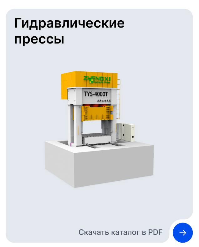
<div class="name">Гидравлические прессы</div>
<img src="app/gyd-press.svg" alt="гидравличесике прессы">
<div class="second-text">Скачать каталог в PDF</div>
</div>.card
position: relative
background-color: #E3E8EF
border-radius: 20px
.name
margin: 14px 0 0 20px
font-size: $h3-style
font-weight: $bold-font
text-align: left
max-width: 300px
.second-text
padding-right: 40px
font-size: $h5-style
font-weight: 500
text-align: right<div class="card">
Card Content
<div class="card__link">
<div class="card__arrow">
<div class="card__arrow__link">
<a href="#">></a>
</div>
</div>
</div>
</div>.card {
--card--bg-color: rgb(227, 232, 239);
position: relative;
width: 400px;
height: 500px;
background-color: var(--card--bg-color);
border-radius: 30px 30px 30px 0;
.card__link {
position: absolute;
bottom: 0;
left: 0;
transform: translateY(100%);
width: 320px;
height: 80px;
background-color: var(--card--bg-color);
border-radius: 0 0 30px 30px;
.card__arrow {
position: absolute;
top: 0;
right: 0;
width: 100px;
height: 100px;
transform: translateX(100%);
&:before {
content: '';
display: block;
width: 50%;
height: 50%;
background-color: var(--card--bg-color);
}
.card__arrow__link {
width: 100%;
height: 100%;
background-color: white;
position: absolute;
top: 0;
border-radius: 100%;
display: flex;
justify-content: center;
align-items: center;
}
a {
display: flex;
justify-content: center;
align-items: center;
color: white;
width: 70%;
height: 70%;
text-decoration: none;
background-color: rgb(0, 78, 235);
border-radius: 100%;
}
}
}
} Средний
 Средний
Простой
Средний
Простой

 а если так попробовать на блоки разбить?)