Привет!
1)Делаю сайт адаптивным. Но как только я перемещаю текст с формой отправки вниз(с зелёной кнопкой), туда же перемещается и текст из Editable Theme, Flat Design и Reach Your Audience, сами заголовки остаются, а вот текст уходит вниз. Как можно решить этот вопрос?
2)Как сделать видео адаптивным и растянуть его на половину секции(там где текст с формой отправки) и какое решение в данном случае будет более приемлимым: текст по середине или сбоку? Логично,что если видео по середине, то и текст надо также размещать.
3)Как избавиться от пустого белого пространства после меню внизу?

<!DOCTYPE html>
<html lang="en">
<head>
<meta charset="UTF-8">
<title>Notify</title>
<link rel="stylesheet" type="text/css" href="style.css">
<meta name="viewport" content="width=device-width, initial-scale=1, maximum-scale=1" />
</head>
<body>
<header>
<div id="main-banner">
<img src="images/banner.jpg">
</div>
<div class="wrapper">
<h1 class="logo">Notify</h1>
<h2>A great new free psd theme to showcase<br> your new application. </h2>
<a href="#!" class="btn">
<img src="images/apple.png">
</a>
<a href="#!" class="btn">
<img src="images/android.png">
</a>
<a href="#!" class="btn">
<img src="images/windows.png">
</a>
</div>
</header>
<main class="wrapper">
<section id="selling-points">
<ul>
<li>
<img src="images/icon-1.png" alt="selling point">
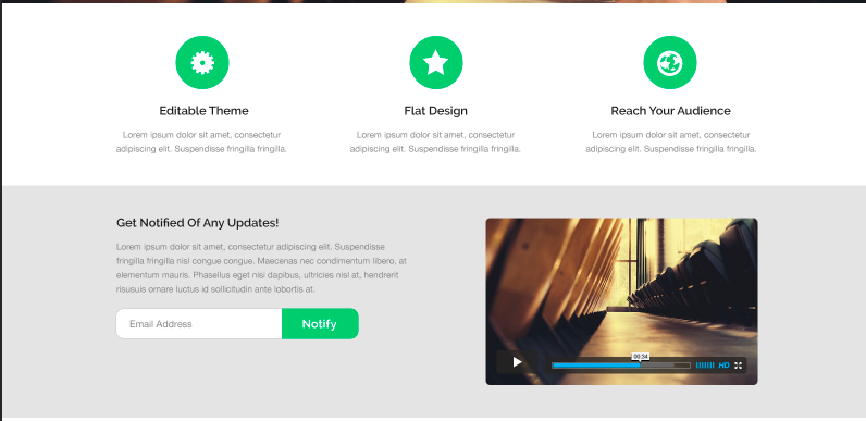
<h3>Editable Theme</h3>
<p>Lorem ipsum dolor sit amet, consectetur adipiscing elit. Suspendisse fringilla fringilla.</p>
</li>
<li>
<img src="images/icon-2.png" alt="selling point">
<h3>Flat Design</h3>
<p>Lorem ipsum dolor sit amet, consectetur adipiscing elit. Suspendisse fringilla fringilla.</p>
</li>
<li>
<img src="images/icon-3.png" alt="selling point">
<h3>Reach Your Audience</h3>
<p>Lorem ipsum dolor sit amet, consectetur adipiscing elit. Suspendisse fringilla fringilla.</p>
</li>
</ul>
</section>
</main>
<section id="notified">
<div><h2>Get Notified Of Any Updates!</h2>
<p>Lorem ipsum dolor sit amet, consectetur adipiscing elit. Suspendisse fringilla fringilla nisl congue congue. Maecenas nec condimentum libero, at elementum mauris. Phasellus eget nisi dapibus, ultricies nisl at, hendrerit risusuis ornare luctus id sollicitudin ante lobortis at.</p>
<form>
<input type="text" placeholder="Email Address"><button>Notify</button>
</form><iframe src="https://player.vimeo.com/video/86207113?title=0&byline=0&portrait=0" width="500" height="281" frameborder="0" webkitallowfullscreen mozallowfullscreen allowfullscreen></iframe></div>
</section>
<section id="contacts">
<h2>Say Hi & Get in Touch</h2>
<p>Lorem ipsum dolor sit amet, consectetur adipiscing elit suspendisse. </p>
<div class="icon"><span><a href="#!" class="btn_1">
<img src="images/twitter.png">
</a></span>
<span><a href="#!" class="btn_1">
<img src="images/facebook.png">
</a></span>
<span><a href="#!" class="btn_1">
<img src="images/pinterest.png">
</a></span>
<span><a href="#!" class="btn_1">
<img src="images/google.png">
</a></span>
<span><a href="#!" class="btn_1">
<img src="images/linkedin.png">
</a></span>
<span><a href="#!" class="btn_1">
<img src="images/youtube.png">
</a></span></div>
</section>
<footer>
<nav>
<h2>Main Navigation</h2>
<span><a href="" class="current">Contact</a></span>
<span><a href="">Download</a></span>
<span>
<a href="">Press</a></span>
<span><a href="">Email</a></span>
<span><a href="">Support</a></span>
<span><a href="">Privacy Policy</a></span>
</nav>
</footer>
</body>
</html>
*{
	font-family: Myriad Pro;
}

body, ul, li {
	margin: 0;
	padding: 0;
}

p, li, h1, h2, h3, h4 {
	color: #4e4e4e;
}

body {
	background: #ffffff;
}

.wrapper {
	width: 96%;
	max-width: 1200px;
	margin: 0 auto;
	padding: 0 2%;
}

header h1.logo {
	margin: 0;
	text-indent: -10000px;
	background: url(images/logo.png);
	background-repeat: no-repeat;
	width: 190px;
	height: 90px;
	position: absolute;
	top: 90px;
	left: 130px;
	clear: both;

}

header h2 {
	margin: 0;
	color: #fff;
	position: absolute;
	top: 190px;
	left: 130px;
	font-size: 18px;
}

.btn {
  display: inline-block;
  list-style-type: none;
  padding: 3px;
  margin: 5px;
  width: 50px;
  height: 50px;
  text-align: center;
  color: #ccc;
  background: rgba(0,0,0,.5);
  border-radius: 50%;
  transition: .3s ease;
  position: relative;
  top: -250px;
  left: 100px;
}

.btn:hover {
  background: #47cf73;
}

.btn img {
  position: absolute;
  top: 50%;
  left: 50%;
  transform: translate(-50%, -50%)
}


header:after {
	display: block;
	content: "";
	clear: both;
}


#main-banner img {
	width: 100%;
	border-top: 8px solid #2ecc71;
}

#main-banner {
	height: 500px;
	overflow: hidden;
}

#selling-points {
	margin-top: -100px;

}

#selling-points li {
	float: left;
	width: 30%;
	padding: 1%;
	text-align: center;
	list-style-type: none;
	line-height: 1.6em;
}
#selling-points:after {
	display: block;
	content: "";
	clear: both;
}


#notified {
  height: 450px;
  background: #e3e3e3;
}

#notified div  {

	width: 500px;
	padding-top: 30px;
	padding-left: 45px;

}

#notified div form  {
	border-radius: 80%;
}


#notified iframe {
	position: relative;
	top: -175px;
	left: 525px;
	border-radius: 3%;
}

.video-responsive{
    overflow:hidden;
    padding-bottom:56.25%;
    position:relative;
    height:0;
}
.video-responsive iframe{
    left:0;
    top:0;
    height:100%;
    width:100%;
    position:absolute;
}

#notified input{
  height:40px;
  line-height:40px;
  font-size:16px;
  padding-left:16px;
  border-radius:10px 0 0 10px;
  border: 1px solid lightgrey;
}

#notified button{
  vertical-align:top;
  background-color:#2ecc71;
  color:white;
  height:44px;
  line-height:44px;
  font-size:18px;
  padding: 0 24px;
  font-weight:bold;
  border-radius:0 10px 10px 0;
  border:none;
}

#notified:after {
	display: block;
	content: "";
	clear: both;
}

#contacts {
	background: #ffffff;
	text-align: center;
}

#contacts h2 {
	font-weight: bolder;
}


.btn_1 {
  display: inline-block;
  list-style-type: none;
  padding: 3px;
  margin: 5px;
  width: 30px;
  height: 30px;
  text-align: center;
  color: #ccc;
  background: rgba(0,0,0,.5);
  border-radius: 50%;
  transition: .3s ease;
  position: relative;
  top: -250px;
  left: 100px;
}

.btn_1:hover {
  background: #47cf73;
}

.btn_1 img {
  position: absolute;
  top: 50%;
  left: 50%;
  transform: translate(-50%, -50%)
}
.icon {
	position: relative;
	top: 250px;
	left: -100px;
	height: 200px;
}


footer {
	background: #e3e3e3;
	padding: 50px 0;
	margin-top: -100px;
	text-align: center;

}

footer nav span {
	list-style-type: none;
	padding: 10px;
	}


footer nav span a {
	text-decoration: none;
	color: #848484;


}

footer nav h2 {
	line-height: 0;
	margin: 0;
	text-indent: -10000px;

}

/* MEDIA QUERIES*/

@media screen and (max-width: 768px){
	header h1.logo{
	background:url(images/logo-m.png);
	background-repeat:no-repeat;
	position: absolute;
	top: 80px;
	left: 130px;
	}
	header h2{
	font-size:14px;
	width:250px;
	position: absolute;
	top: 140px;
	left: 130px;
	}
	.btn {
		width:35px;
		height:35px;
		position: relative;
  		top: -310px;
  		left: 100px;
	}

	#notified {
		height:600px;
	}
	#notified div h2,p, form {
		position:relative;
		top:280px
	}

	#notified iframe {
		position:relative;
		top:-290px;
		left:20px
	}

	#selling-points{
		height:150px;
	}

	#selling-points li {
		position:relative;
		top:-150px;
	}


}


 Простой

