<div class="page">
<header class="page_header">
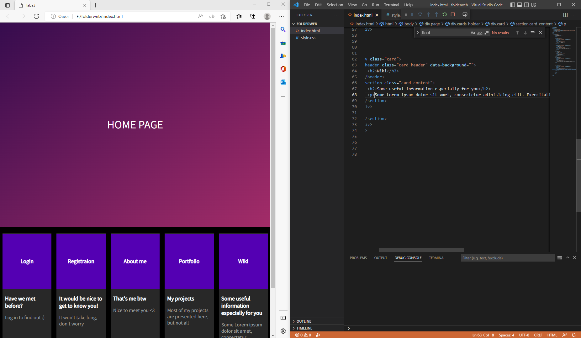
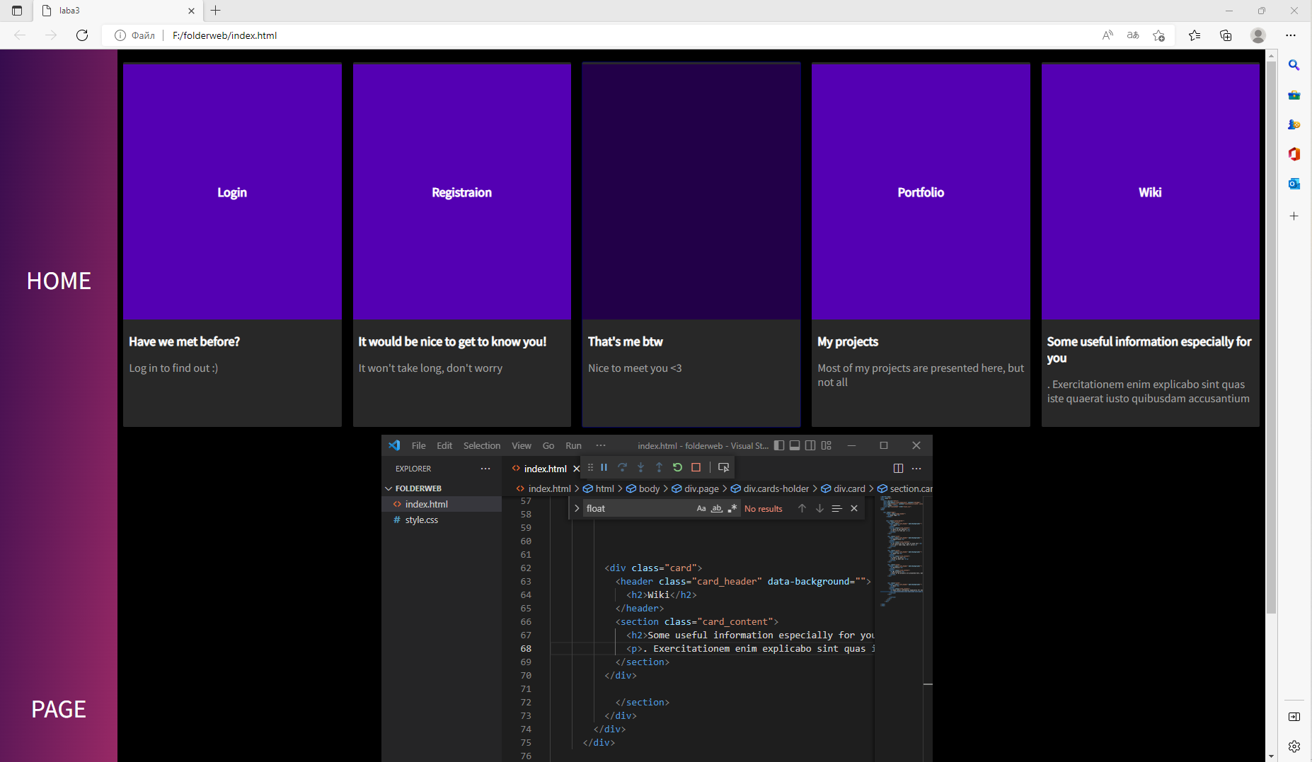
<h1>Home Page</h1>
</header>
<div class="cards-holder">
<div class="card">
<header class="card_header" data-background="">
<h2>Login</h2>
</header>
<section class="card_content">
<h2>Have we met before?</h2>
<p>Log in to find out :)</p>
</section>
</div>
<div class="card">
<header class="card_header" data-background="">
<h2>Registraion</h2>
</header>
<section class="card_content">
<h2>It would be nice to get to know you!</h2>
<p>It won't take long, don't worry</p>
</section>
</div>
<div class="card">
<header class="card_header" data-background="">
<h2>About me</h2>
</header>
<section class="card_content">
<h2>That's me btw</h2>
<p>Nice to meet you <3</p>
</section>
</div>
<div class="card">
<header class="card_header" data-background="">
<h2>Portfolio</h2>
</header>
<section class="card_content">
<h2>My projects</h2>
<p>Most of my projects are presented here, but not all</p>
</section>
</div>
<div class="card">
<header class="card_header" data-background="">
<h2>Wiki</h2>
</header>
<section class="card_content">
<h2>Some useful information especially for you</h2>
<p>Some Lorem ipsum dolor sit amet, consectetur adipisicing elit. Exercitationem enim explicabo sint quas iste quaerat iusto quibusdam accusantium </p>
</section>
</div>
</section>
</div>
</div>
</div>
@import url(https://fonts.googleapis.com/css?family=Source+Sans+Pro);
:root {
  font-size: 16px;
  font-weight: 300;
}

* {
  -webkit-font-smoothing: antialiased;
  -moz-osx-font-smoothing: greyscale;
  box-sizing: border-box;
}

html, body {
  float: left;
  width: 100%;
  height: 100%;
  padding: 0;
  margin: 0;
}

body {
  background: #000;
  font-family: "Source Sans Pro", helvetica Neue, sans-serif;
  font-variant-ligatures: common-ligatures;
  font-weight: 300;
}

.page {
  width: 100%;
  display: flex;
  flex-direction: row;
  flex-wrap: wrap;
}
.page header.page_header {
  background: linear-gradient(to bottom right, #360c4e, #a32c68);
  color: #fff;
  flex: 1;
  text-align: center;
  min-height: 60vh;
  overflow: hidden;
  position: relative;
}
.page header.page_header:before {
  content: "";
  display: block;
  float: left;
  width: 100%;
  height: 100%;
  background: url(https://s3-us-west-2.amazonaws.com/s.cdpn.io/64/starry_night_sky.png) no-repeat center center/cover;
  position: absolute;
  z-index: 1;
  box-shadow: inset 0 0 200px #000;
  opacity: 1;
  mix-blend-mode: darken;
}
.page header.page_header h1 {
  font-weight: 400;
  line-height: 60vh;
  text-transform: uppercase;
  position: relative;
  width: 100%;
  z-index: 1;
}
.page .cards-holder {
  display: flex;
  flex-direction: row;
  background: #181818;
  color: #fff;
  position: relative;
  z-index: 3;
  height: 100%;
  float: left;
  padding: 1em 0;
  flex-wrap: wrap;
}
.page .cards-holder .card {
  margin: 0 8px;
  background: #282828;
  padding: 8px;
  overflow: hidden;
  border-radius: 2px;
  cursor: pointer;
  flex-basis: calc(20% - 16px);
  transition: box-shadow 0.2s ease;
}
@media all and (max-width: 680px) {
  .page .cards-holder .card {
    flex-basis: calc(50% - 16px);
    margin-top: 8px;
  }
}
.page .cards-holder .card header {
  background: lime;
  min-height: 20vw;
  position: relative;
  top: -20px;
  left: -8px;
  width: calc(100% + 16px);
  text-align: center;
}
.page .cards-holder .card header:after, .page .cards-holder .card header:before {
  content: "";
  display: block;
  width: 100%;
  height: 100%;
  position: absolute;
  background: #000;
  top: 0;
  left: 0;
  z-index: 0;
  opacity: 0.3;
}
.page .cards-holder .card header:before {
  content: "";
  font-size: 1rem;
  line-height: 20vw;
  z-index: 2;
  display: none;
  background: rgba(0, 0, 0, 0.6);
  opacity: 1;
  font-weight: bold;
}
.page .cards-holder .card header h2 {
  font-size: 1rem;
  line-height: 20vw;
  position: relative;
  z-index: 1;
}
.page .cards-holder .card:hover {
  box-shadow: 0 0 0 1px rgba(39, 194, 90, 0.4);
}
.page .cards-holder .card:hover header:before {
  display: block !important;
  z-index: 4 !important;
}
.page .cards-holder .card:hover header:after {
  display: none !important;
}
.page .cards-holder .card:hover header h2 {
  visibility: hidden;
}
.page .cards-holder .card_content {
  max-height: 300px;
  max-width: 100%;
  overflow: hidden;
  text-overflow: ellipsis;
  position:relative;
  top: -16px;
}
.page .cards-holder .card_content h2 {
  font-size: 1rem;
  position: relative;
  z-index: 1;
  padding: 0;
  padding-bottom: 0.5rem;
  margin: 0;
}
.page .cards-holder .card_content p {
  color: #A0A0A0;
  font-weight: 400;
  font-size: 0.9rem;
  padding: 1;
  margin: 0.4rem 0;
}


 Простой
 Простой


