Whitejamer
@Whitejamer

Как сверстать данный компонент купона?

Меня завели в тупик эти впуклости по бокам в виде треугольников. Не было бы проблем если бы в дизайне не было тени от смарт-объекта который состоит из квадрата соединенного с этими треугольниками. Так же на смарт объекте есть маска в которую помещена картинка и таким образом она обрезается.

Есть ли какие нибудь мысли как это лучше всего сделать?

5f0dad4d5ee65385954654.png

UPD: HTML и CSS
<main class="other-col__content">
                <div class="content__coupon">
                    <div class="coupon__info">
                        <div class="info__top">
                            <h3 class="top__title">
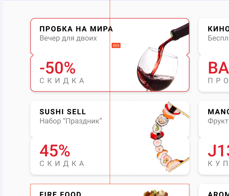
                                пробка на мира
                            </h3>
                            <p class="top__description">
                                Вечер для двоих
                            </p>
                        </div>
                        <div class="info__bottom">
                            <div class="bottom__num">
                                -50%
                            </div>
                            <div class="bottom__label">
                                СКИДКА
                            </div>
                        </div>
                    </div>
                    <div class="coupon__img">
                        <img src="./assets/images/image 1.png" alt="coupon__img">
                    </div>
                    <div class="triangle left"></div>
                    <div class="triangle right"></div>
                </div>
            </main>


/* Content */
    .other-col__content{
        display: flex;
        flex-direction: row;
        background-color: #FAFAFA;
        min-height: 100%;
        padding: 40px 60px
    }
        .content__coupon{
            position: relative;
            display: flex;
            flex-direction: row;
            justify-content: space-between;
            background-color: #FFFFFF;
            border-radius: 10px;
            height: 160px;
            width: 347px;
            box-shadow: 0px 2px 6px rgba(0, 0, 0, 0.15);
            border-radius: 10px;

        }
            .triangle{
                position: absolute;
                top: 40%;
                width: 30px;
                height: 30px;
                background: #FAFAFA;
                /* border: 1px solid #000; */
                border-radius: 1px;
            }
                .triangle.left{
                    left: -5%;
                    transform: rotate(45deg);
                    box-shadow: 0px 2px 6px rgba(0, 0, 0, 0.15);
                }
                .triangle.right{
                    right: -5%;
                    transform: rotate(95deg);
                    box-shadow: 5px 5px 5px rgba(0, 0, 0, 0.15);
                    box-shadow: inset;
                }
            .coupon__info{
                display: flex;
                flex-direction: column;
                justify-content: space-between;
                height: auto;
            }
                .info__top{
                    display: flex;
                    flex-direction: column;
                }
                    .top__title{
                        font-family: Roboto;
                        font-style: normal;
                        font-weight: bold;
                        font-size: 16px;
                        line-height: 16px;
                        letter-spacing: 0.1em;
                        text-transform: uppercase;
                        color: #000000;
                        margin-bottom: 5px;
                    }
                    .top__description{
                        font-family: Roboto;
                        font-style: normal;
                        font-weight: normal;
                        font-size: 16px;
                        line-height: 16px;
                        color: #000000;
                        opacity: 0.5;
                    }
                .info__bottom{
                    display: flex;
                    flex-direction: column;
                }
                    .bottom__num{
                        font-family: Roboto;
                        font-style: normal;
                        font-weight: 500;
                        font-size: 36px;
                        line-height: 28px;
                        color: #DF212D;
                        margin-bottom: 5px;
                    }
                    .bottom__label{
                        font-family: Roboto;
                        font-style: normal;
                        font-weight: normal;
                        font-size: 16px;
                        line-height: 16px;
                        letter-spacing: 0.4em;
                        text-transform: uppercase;

                        color: #000000;

                        opacity: 0.5;
                    }

            .coupon__img{
                display: flex;
                flex-direction: column;
            }
  • Вопрос задан
  • 258 просмотров
Решения вопроса 1
Get-Web
@Get-Web Куратор тега CSS
Front-End Developer
Квадратные накладки, которые вы сделали чтобы имитировать угол, в данном случае не подойдет. Поэкспериментируйте с filter: drop-shadow() и clip-path

Ответ написан
Пригласить эксперта
Ваш ответ на вопрос

Войдите, чтобы написать ответ

Войти через центр авторизации
Похожие вопросы