HTML-разметка:<body>
<wrapper class="wrapper">
<header class="header">
<div class="container">
<div class="header_top">
<a class="logo" href="#"><svg width="224" height="115" viewBox="0 0 224 115" fill="none" xmlns="http://www.w3.org/2000/svg">
svg-файл
<a class="phone" href="tel:89855415544">+7 (985) 541-55-44</a>
<ul class="social">
<li><a class="watsapp" href="https://wa.me/+7985555554"><svg width="40" height="41" viewBox="0 0 40 41" fill="none" xmlns="http://www.w3.org/2000/svg">
<g clip-path="url(#clip0_7_47)">
svg-файл
</a>
</li>
<li><a class="telegram" href="https://t.me/bohemian_grove"><svg width="65" height="35" viewBox="0 0 65 35" fill="none" xmlns="http://www.w3.org/2000/svg">
svg-файл
</a>
</li>
</ul>
</div>
<div class="header-top_line"></div>
<main class="main">
<section class="header-bottom">
Стили CSS:.wrapper {
max-width: 100%;
min-height: 100%;
display: flex;
flex-direction: column;
box-sizing: border-box;
}
.main {
flex-grow: 1;
}
.header {
background-image: url(images/bg-dark.jpg);
background-position: center;
background-repeat: no-repeat;
background-size: cover;
min-height:100%;
color: #fff;
margin-bottom: 30px;
}
.container {
max-width: 1114px;
margin: 0 auto;
padding: 0px 20px 0px 20px;
}
.header_top {
display: flex;
flex-direction: row;
flex-wrap: wrap;
justify-content: space-between;
align-items: center;
padding: 17px;
font-family: 'Lato',sans-serif;
font-weight: 400;
font-size: 25px;
}
.logo {
}
.phone:hover {
background: rgba(255, 245, 215, 0.3);
padding: 10px;
border-radius: 20px;
transition: .3s ease;
}
.social {
display: flex;
align-items: center;
}
.watsapp {
padding-right: 20px;
}
.watsapp:hover path {
fill: #8826AB;
transition: fill .3s ease;
}
.telegram:hover path {
fill: #8826AB;
transition: fill .3s ease;
}
.header-top_line {
background-color: rgba(255, 245, 215, 0.7);
height: 1px;
margin: 0 20px 50px 20px;
}
Медиа-запросы:@media (max-width:1200px) {
.steps-inner {
display: flex;
flex-direction: column;
justify-content: center;
align-items: center;
}
.steps-item {
margin-bottom: 30px;
}
.trust-inner {
display: flex;
flex-direction: column;
justify-content: center;
align-items: center;
}
.right-items {
padding-left: 30px;
padding-right: 30px;
}
.money-img {
padding-top: 50px;
}
.about-money {
padding: 0 10px 0px 10px;
}
}
@media (max-width:1000px)
{
.header-bottom {
display: flex;
justify-content: center;
align-items: center;
gap: 30px;
}
.menu_btn {
display: flex;
}
.menu_btn,
.logo {
position: relative;
z-index: 10;
}
.menu-list {
position: absolute;
z-index: 5;
background-color: #1D1721;
flex-direction: column;
top: 0;
left: 0;
right: 0;
bottom: 0;
padding-top: 100px;
height: 100vh;
align-items: center;
transform: translateY(-100%);
transition: transform .3s ease;
}
.menu-list.menu-list--active {
transform: translateY(0);
}
.menu {
background: none;
}
.header-title {
max-width: 400px;
}
.buttons {
display: flex;
flex-direction: column;
justify-content: center;
gap: 15px;
align-items: center;
padding-bottom: 30px;
}
.header-btn {
padding: 0;
}
.left_money {
margin-bottom: 30px;
}
}
@media (max-width:924px) {
.about-money {
display: flex;
flex-wrap: wrap;
flex-direction: column;
align-items: center;
}
.right_money {
}
.money-text {
word-wrap: break-word;
max-width: 400px;
}
}
@media (max-width:647px) {
.phone {
font-size: 20px;
}
.social {
display: flex;
flex-direction: column;
}
.header-bottom {
display: flex;
flex-direction: column;
justify-content: center;
align-items: center;
}
.header-title {
padding-bottom: 10px;
}
.about-money {
display: flex;
justify-content: flex-start;
display: table-cell;
}
}
@media (max-width:567px) {
.header_top {
display: flex;
flex-direction: column;
}
.social {
display: flex;
flex-direction: row;
padding-top: 10px;
}
.steps-inner {
padding-top: 30px;
}
.steps-item_title {
padding-left: 0;
}
.wrapper {
}
.header-contacts {
display: flex;
justify-content: center;
align-items: center;
gap: 30px;
}
.steps {
margin: 0 auto;
}
.steps-inner {
padding: 70px 20px 0 20px;
/* width: 100%;
max-width: 33%;
margin: 0 auto; */
}
.steps-item_title::before {
display: none;
}
.steps-item {
}
.right_money {
padding-right: 20px;
}
.money-text, .large-title_money, .money-list {
padding-left: 20px;
}
.about-left_title {
width: 100%;
max-width: 287px;
height: 133px;
background-size: cover;
}
}
}
Это многостраничный сайт, где wrapper служит оберткой для всех страниц, main - это 1 страница. С помощью свойств в этих тэгах "прижат" футер".
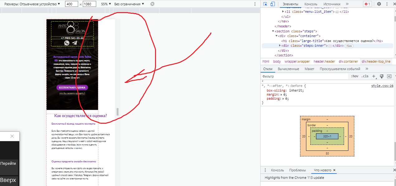
проблема состоит в том, что после отметки 530 при уменьшении в инструментах разработчика, весь этот wrapper вместе с фоновыми изображениями в шапке и в секции просто перестает растягиваться на всю ширину экрана и оставляет отступ справа, хотя никаких отступов я не добавляла, и даже подключила файл reset. Как исправить данную ситуацию?
ниже прилагаю фото с проблемой во весь рост, и, к сожалению, не во всю ширину.


 Простой


